top of page

Youimpact
Android mobile app platform & landing page website for young adults to find various opportunities where they can easily volunteer, develop their skills, travel, and impact their community and the world through volunteering.
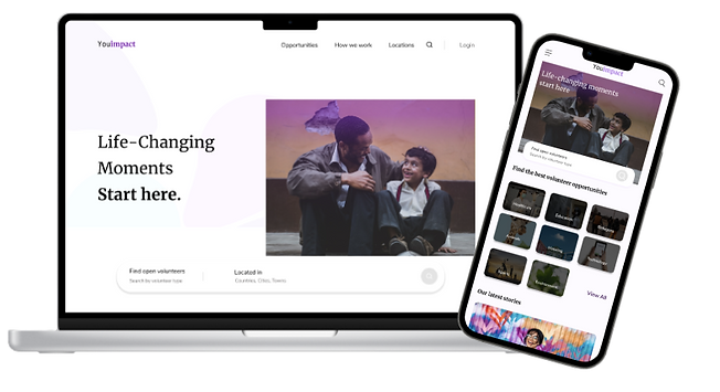
Time Scope: 3.7 Months
Role: UX Researcher - UX Designer
Tools: Figma - Figma jam - Miro - Zoom
Challenge
Students, fresh graduates, and employees can not find an easy and flexible way to volunteer with their time, skills, and other resources. They can not efficiently approach trustworthy volunteering organizations/ events and connect with volunteering communities.
.png)
Approach
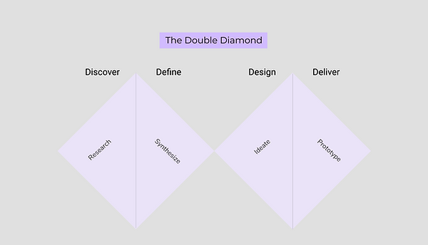
The approach of this project is User Centeric Design approach. The goal is to design based upon an explicit understanding of users, tasks, and environments. This UX design process is driven by user-centered evaluation and addresses the whole user experience. Thus, I used the double diamond design method for this project to discover the volunteering problems for young adults, define a specific problem, design a functional digital solution and deliver a prototype.
UX Design Process
1. Discover: UX Research
This user research informs the design process from the end user's perspective. I wanted to discover who my users are? When are they using a similar app/platform? How are they accessing it?
1.1 User Interview
In this qualitative research, I approached the user interview method to get answers to the previous questions. I interviewed three participants online through the Zoom platform. I asked open-ended questions about specific instances and avoided leading questions.
-Have you done any volunteer work before? Can you tell me about it? What made you volunteer there?
-Where was it? How did you feel when you volunteered there? What challenges faced you when you did the volunteer work?
-When you volunteered before, did it matter to you to witness the results of the volunteer work you did?
-Where would you volunteer? In your country? In the place you live? In other countries?
-If you felt like you wanted to volunteer in sth this month, what steps would you take?
-What might be the obstacles that wouldn’t make you volunteer more?
-What category would you like to volunteer in? For instance, mentoring children, health, building renovations, and food banking.
-What might be the obstacles that don’t make you volunteer more?
1.2 Key Findings: Three Interviews Total
Two interviewees mentioned that their problem with volunteering with events or organizations was too much commitment. Therefore, they need to have flexible options to have time to volunteer besides their other work or study commitments.

2.Define: Affinity Map
After conducting the user interviews, I created an affinity map to reveal underlying themes concerning volunteering from large sets of qualitative data. I created six themes and divided them into challenges, time & place, volunteer types, results, motivations & first steps.

.png)
2.1 Competitive Analysis
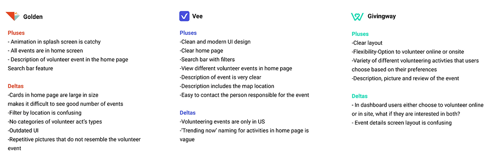
I worked on a competitive analysis using the pluses and deltas method to understand more about the volunteering industry. To know the weaknesses and strengths of the other volunteering apps so I can create a digital solution and make it the best choice of all those available.
2.2 User Flow
I worked on user flow diagrams to display the complete path the user takes when they select a volunteer event. The user flow lays out the user’s movement through the application, mapping out each and every step the user takes- from the entry point right through to the final interaction. I created this user flow to help me identify the screens and components I need to design.

2.3 Persona
After conducting user research, I created this persona to summarize the design research and to ensure that I am designing for a specific user group rather than ‘everyone’ or ‘myself’. Moreover, to focus design efforts on solving specific problems. like ‘reaching out to volunteering events near the person’s place or getting support when the person volunteers.
.png)
3. Design: Sketching
I started to sketch using the crazy 8 technique to foster ideas and rapidly translate my ideas into something tangible. I sketched eight different ideas in eight minutes, each idea in one minute and then I chose the best idea to proceed with.
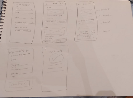
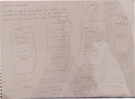
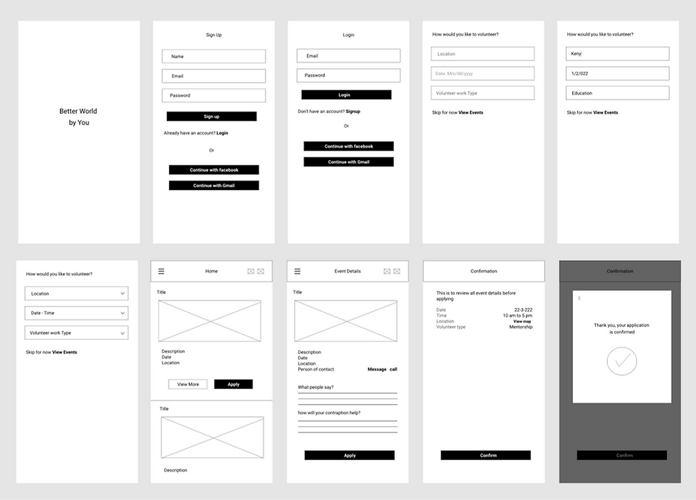
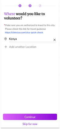
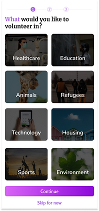
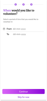
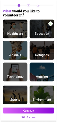
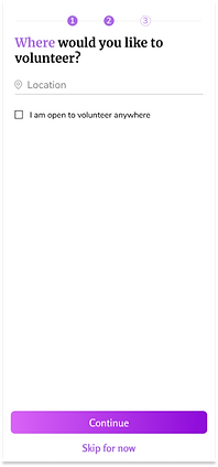
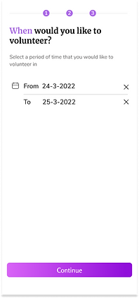
Then I sketched the onboarding and application for events wireframes. In the onboarding I presented an option for the user to pick what he loves to volunteer in, he can also choose the location and the time he is available to volunteer.
3.1 Low Fidility Wireframes
3.2 Design System
3.2 Design System
3.2 Design System
created a design system that includes all the visual aspects of the prototype, including colors, typography, illustrations, grid, icons, and components.
created a design system that includes all the visual aspects of the prototype, including colors, typography, illustrations, grid, icons, and components.
I created a design system that includes all the visual aspects of the prototype, including colors, typography, illustrations, grid, icons, and components.
Colors
Colors
Primary Colors
Secondary Colors
Secondary Colors
.png)
Typography
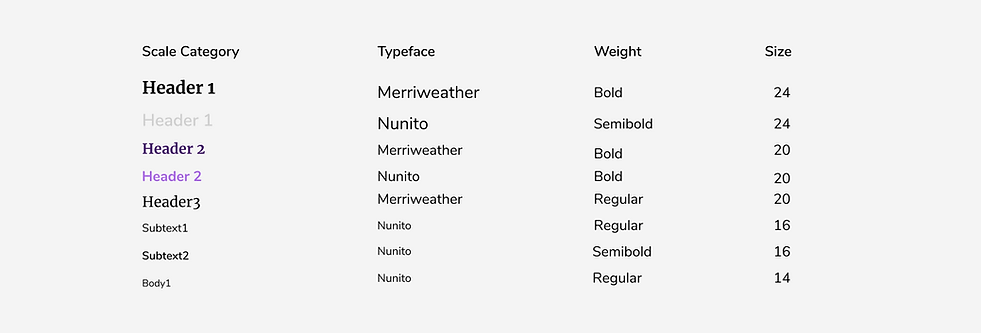
For the typography, I choose to have a serif font ‘Merriweather’ , and a sans serif font ‘Nunito’ to compliment each other.
Responsive Layout Grid
Responsive Layout Grid
Responsive Layout Grid
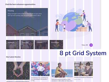
For this prototype, I used 8 point grid system. It provides a visual hierarchy to elements and drives consistent scalability with fewer decisions. When designing the UI looks cleaner, better, and more beautiful, it is the best communication system between designers and developers. A developer can easily understand and eyeball the 8pt increment.
.png)
Accessibility
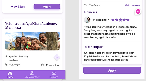
After conducting feedback concerning accessibility, color contrast, and the font hierarchy, I changed the colors to be darker and the font to be larger. I improved the app’s accessibility to enhance its usability for all users, including those with low vision.
Before
After

3.3.High Fidility Prototype: Mobile App
Onboarding
In the app's onboarding, I obtain information about users' preferences in volunteering and let users customize their experiences and select their options fast.



Apply for Event
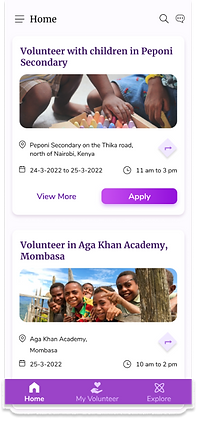
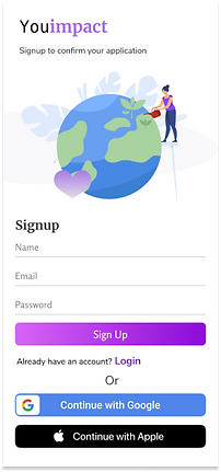
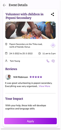
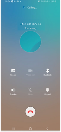
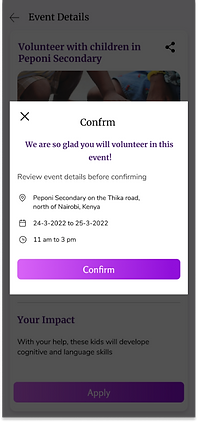
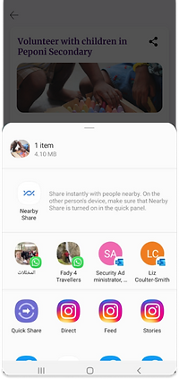
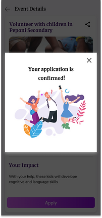
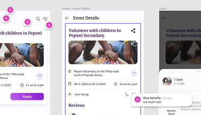
This is the main flow where the user views all available volunteering events and views specific event details, he can share the event, view the location of the event on a map, he can call the person responsible for this event, and can register after viewing all events and before applying for an event. After registering, and confirming the application, the user will view a confirm message of the application for the event.
Gamification


Your Volunteer
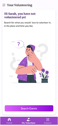
The user can view all his volunteering history, and the upcoming events. Also, In this flow, I applied an interaction where the user shakes the mobile to view the jar open, and the hearts float away, a sort of delight for the user and a resemblance of his impact while they volunteer.


Explore
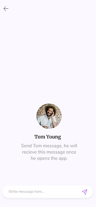
The user can search for charity profiles or people profiles, explore other people’s experiences in volunteering, and message people. in the future, there could be a feature where users can add people to their friends' lists.
Side Menu
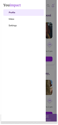
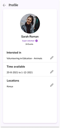
In the side menu, select to view his profile, view inbox, or click settings. In the profile screen, the user can edit his preferences for volunteering. In the inbox screen, the user can view all the chats and calls he made.


3.4 High Fidility Prototype: Landing Page
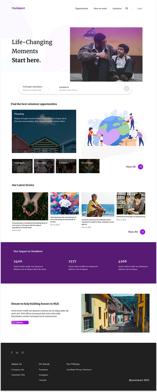
I created a responsive landing page, so users can easily access the product, get a chance to know what it has, then downloads the app.

3.5 Usability Heuristics
#1: Visibility of system status
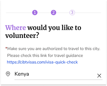
The design should always keep users informed about what is going on, through appropriate feedback within a reasonable amount of time. Or in the screen showen, the user is informed about how many steps left to finish the quessionaire
#2: Match between system and the real world
The design should speak the users' language. Use words, phrases, and concepts familiar to the user, rather than internal jargon. Follow real-world conventions, making information appear in a natural and logical order. I applied this in the language and UX writing, the icons and all the app’s component.
In this project, I got a lot of feedback through the whole design process about the app navigation, flow, and style. And hence, there was continuous iteration and improvement done.
4. Deliver: Feedback loop
Results
A functionable solution is created for adults to easily, quickly, and efficiently volunteer. The app offers a very flexible solution where users get to choose the time, place, and category they would like to volunteer in.
.png)
bottom of page
